Work & Experiences
Welcome to my work & experience space, feel free to explore and read about my process in solving each project.
EUL Student App
Year: 2023 Type: Companion Web Application Front-End: BootStrap 5, JavaScript, CSS3, JQuery, HTML5 Back-End: Django, Python Team Size: 2
Developers: Sana Mngadi
Designers UI/UX: Baga
Last Know Domain: https://app.pixrweb.com/
Objective
This is a project aimed at improving students academic lifestyle by providing all their data and educational information in a user friendly manner with automated tasks and helpful guides.
Story
This project started off as a personal project I decided to build 1 week after I started at the University as a student.
I was using their online platforms OIBS and Moodle for the first week and I immediately felt how out-dated the platforms felt, I decided to explore their platforms and script solutions for tasks that can be automated, shortened or improved.
A little background into OIBS:
OIBS is their platform for storing student curriculum, grades and schedules. We use it to find out what courses we are doing in the semester and what our schedules are for the week.
At the end of the semester we check it to see what our final grades are and CGPA.
My day to day using OIBS would be mostly checking my weekly schedule and room numbers for the courses while walking around campus trying to find exactly where is this room. This ended up giving me an idea as well for finding classrooms on campus.
Now a little background into Moodle:
Moodle is their platform for giving students assignments, lecture notes, quizzes, notifications and lecture videos.
Each course had it's own style of notifying students of any exams, assignments or new lecture notes/videos, but unfortunately they mostly failed at notifying the students. I am sure with the right training for the lecturers on how to use the software, they would be able to understand how to properly utilize the notification systems, structure their pages properly and post new notes & videos in their appropriate sections.
My day to day using Moodle would consist of just watching lecture videos and finding notes, sometimes I would check the calendar for new events, but this was confusing at times because courses would use their CODE instead of their NAME so I would not be able to immediately know which course is having an event without having to click the link to open the course and read the description of the course.
So down bellow I give a breakdown on what the issues are and how I planned to fix them.
Problems
OIBS
OIBS problems:
- Not responsive.
- Too many clicks to perform a simple task.
- Out-dated UI/UX.
- Unnecessary information.
- Short session periods.
- Forgot password not working (failure on the backend and reCAPTCHA).
- No building information.
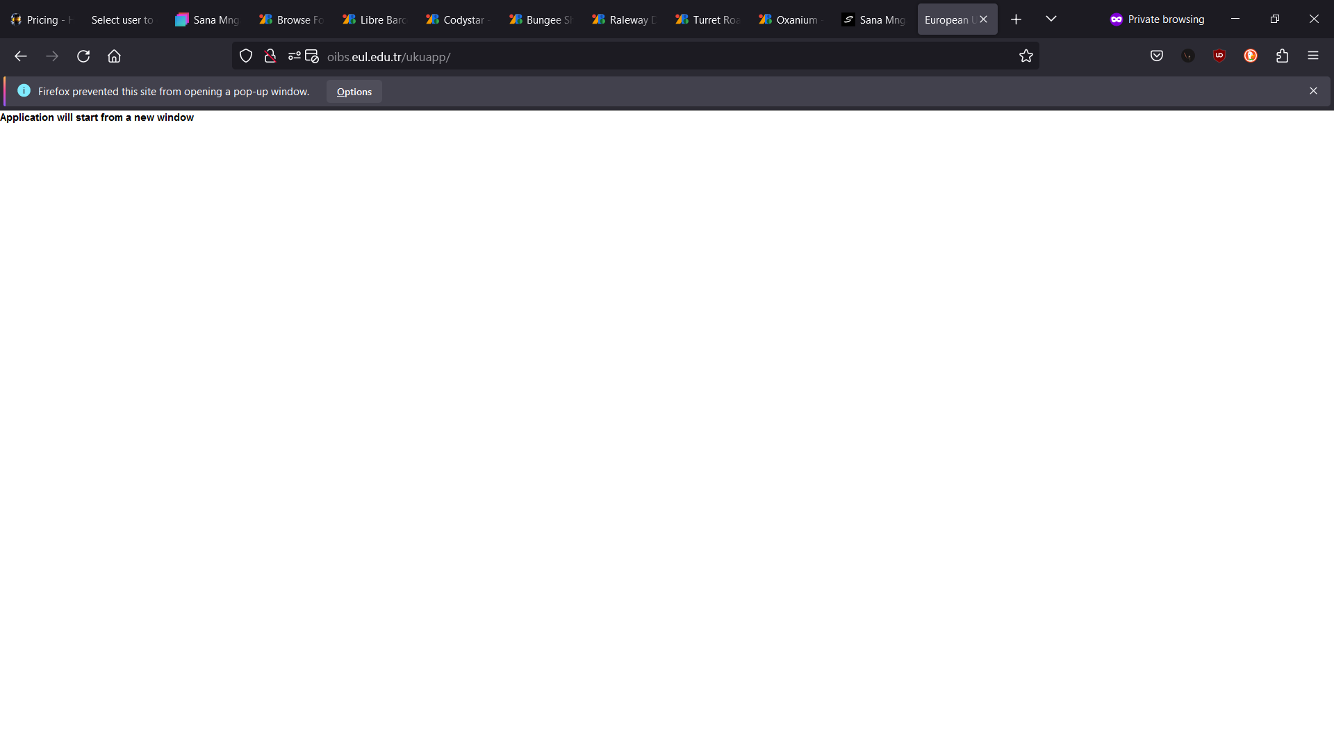
Slide 1 - When visiting the website it will always require you to open a new tab, this is very inconvenient for the user and some users may even start thinking that they are being hacked.
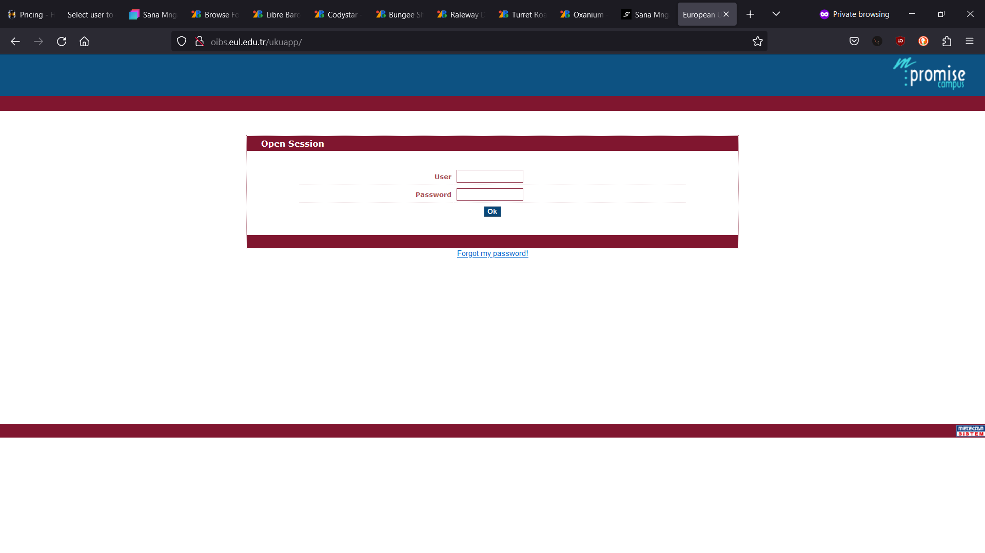
Slide 2 - Since the website is not responsive the login form on mobile screens is difficult to fill in and press the tiny "Ok" button that means "Login". This button is so tiny, if the user does not zoom in they can accidentally press on the password field and make the keyboard prompt instead of pressing the "Ok" button.
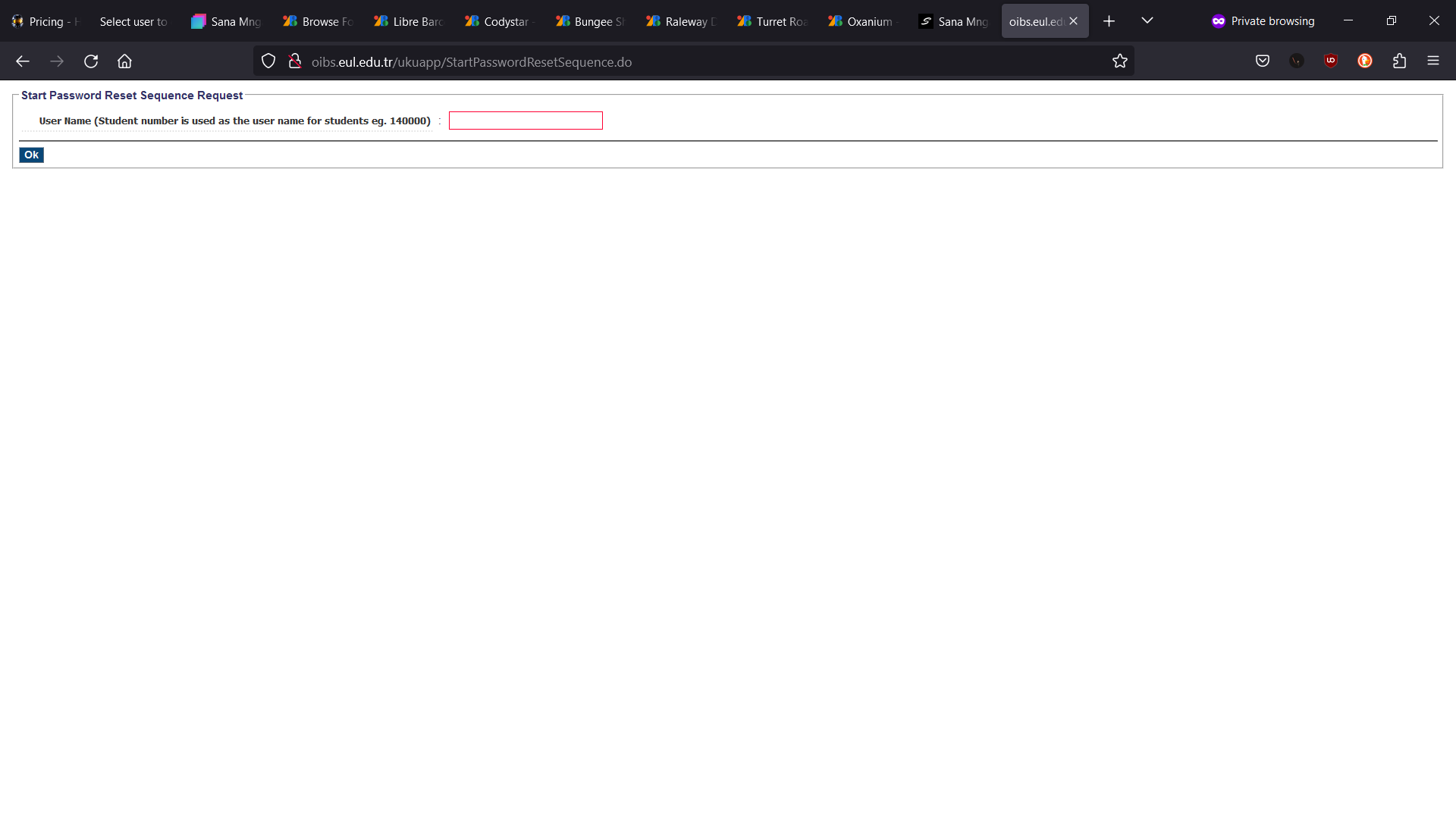
Slide 3 - For those that forgot their passwords and want to reset their password they would typically come to the "Forgot Password" page to reset their password. Unfortunately this does not work as their Back-end does not send the email with the link to reset the password to the student email portal (Another story for another day) so the only way to reset your password is to go to the Student Affairs office and stand in line to have your password reset for you.
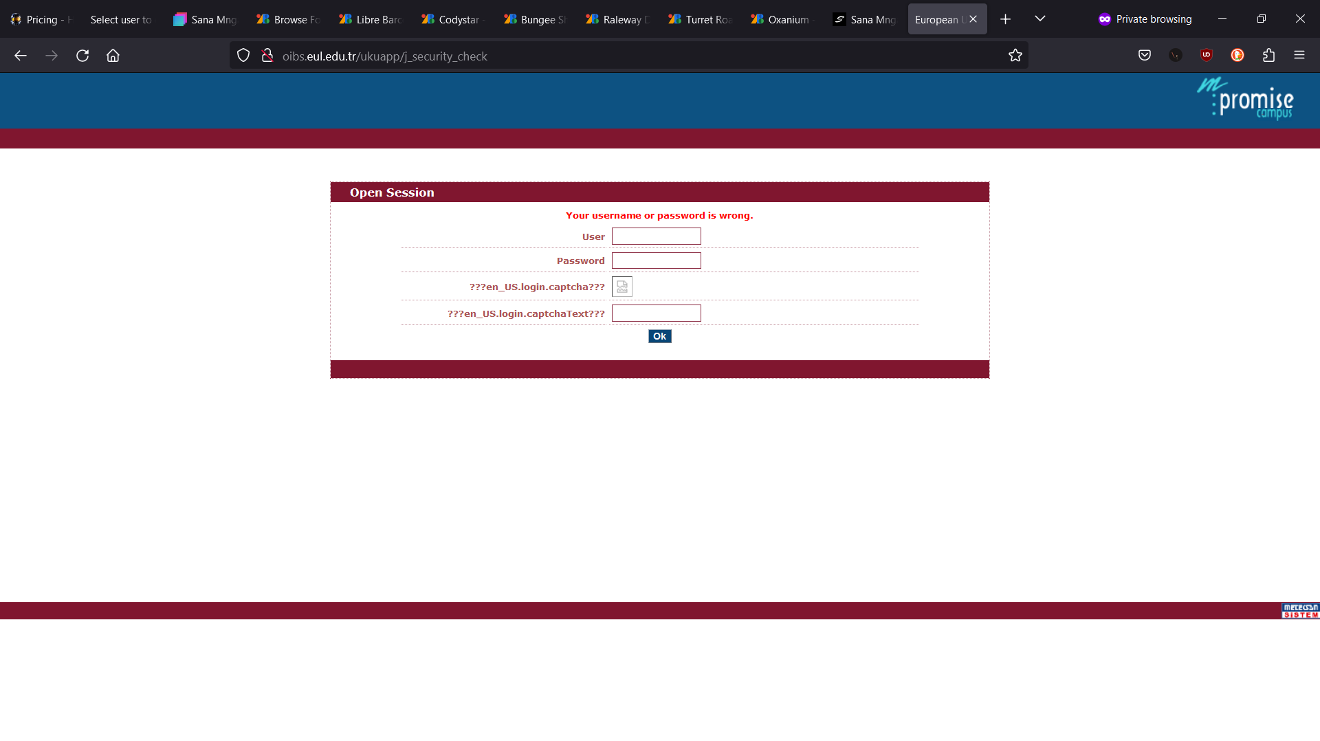
Slide 4 - Sometime you may put in the password wrong a couple of times before requiring a reCAPTCHA, here the reCAPTCHA is forced on the user on the first failed attempt and the image fails to load all the time (I don't know the reason for the image to fail, but it seems to happen all the time).
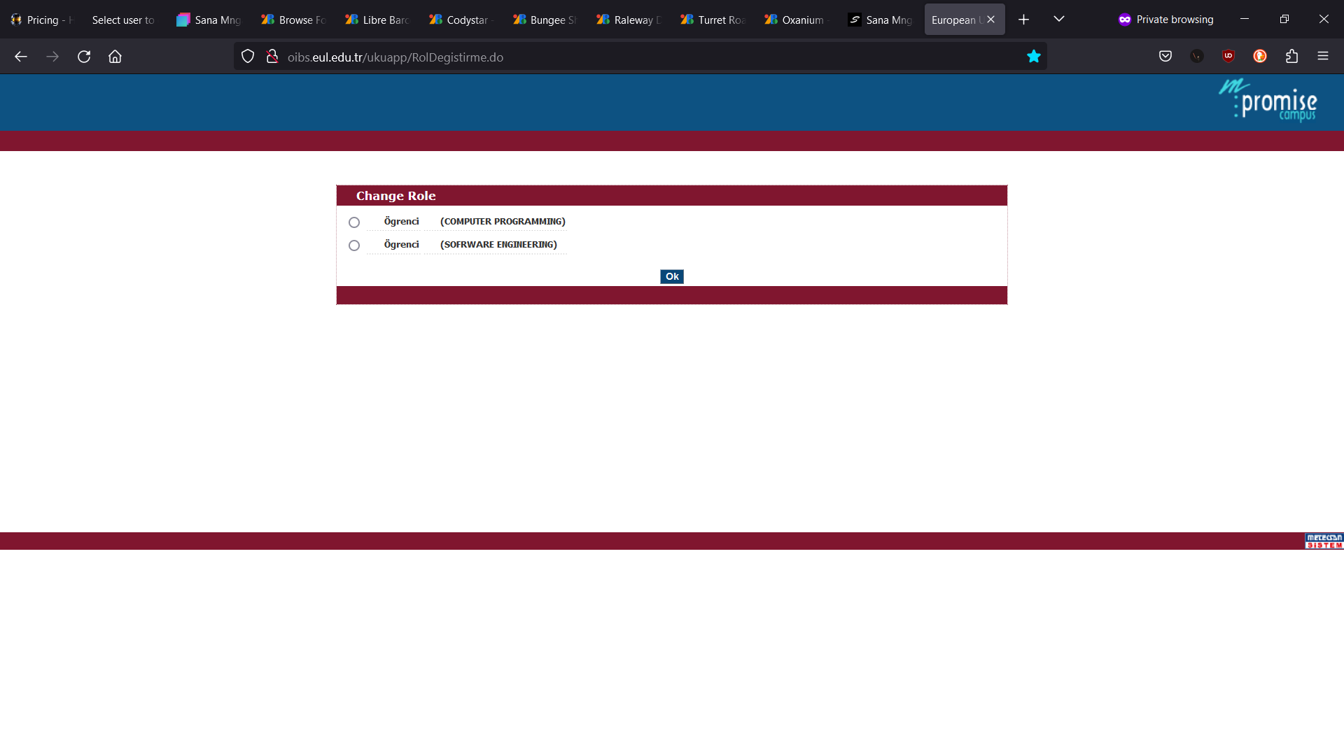
Slide 5 - This is one of the most confusing parts for me when I was scripting the solution, as I don't understand the reason for choosing a role. Most users are given a role to choose, but they all end up in the same place with no change to information or permissions.
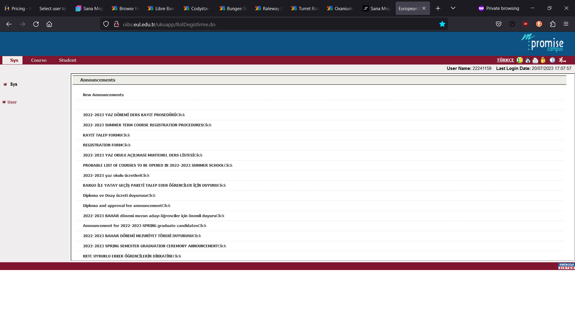
Slide 6 - On this page we can see a list of announcements, some in English and some in Turkish. Next to the titles there is a "Click" link that sends the user to a PDF. The mixture of Turkish and English in the same list makes it hard to quickly check for new announcements.
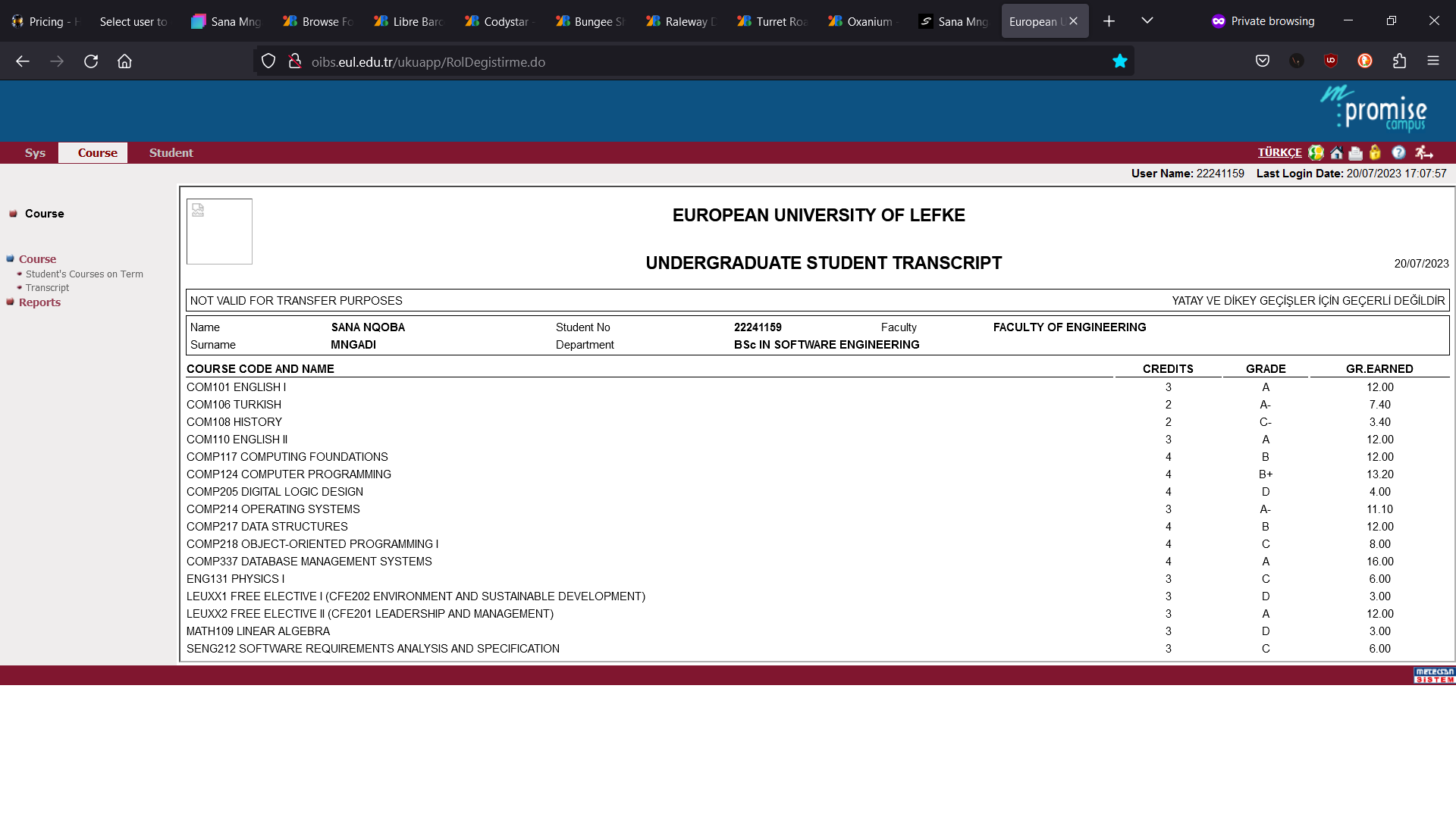
Slide 7 - On this page we can find our transcript information, it gives us all the information we need. I don't think there any issues here except for the amounts of clicks required to reach this page and having to look through all the links in the side menu to find where the transcript page is.
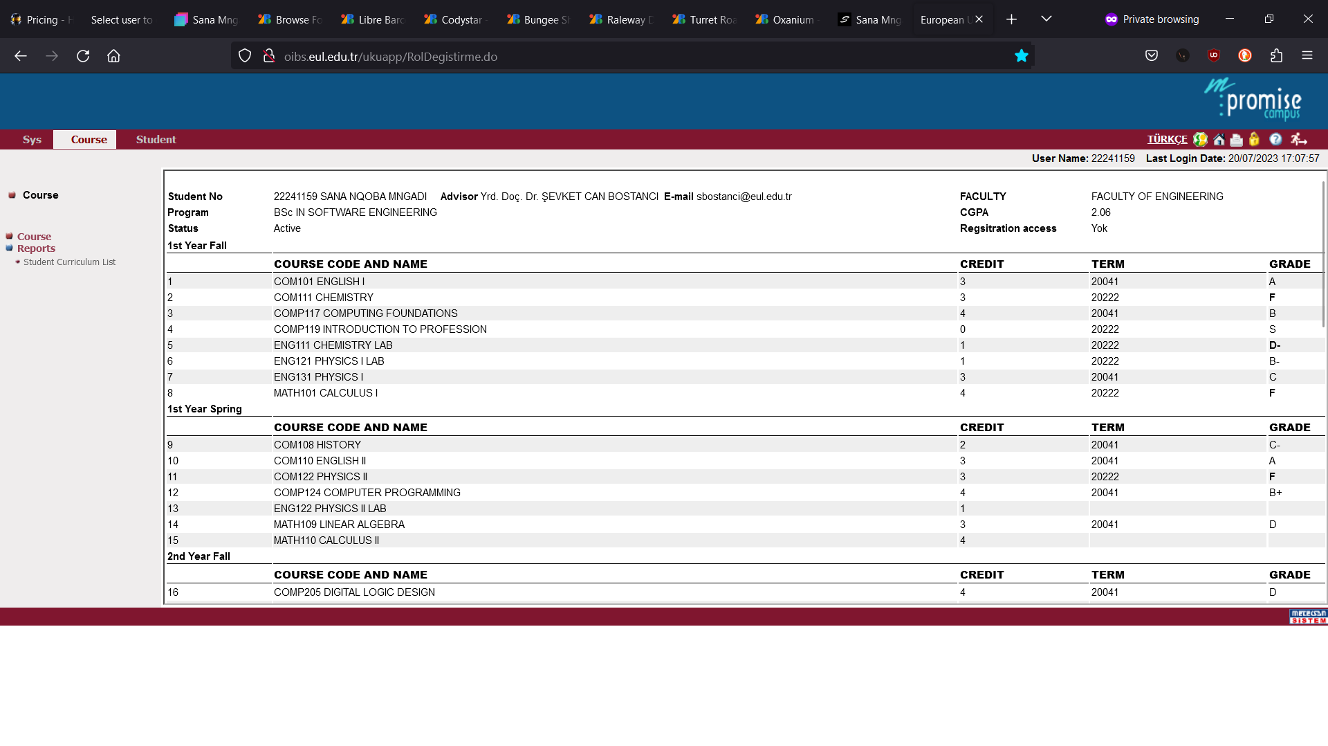
Slide 8 - On this page we can find our Curriculum where we can find what courses we are doing this semester marked with a * and how many credits each course is worth. At first the * is very confusing as there is no information on the page that indicates how to identify what courses you are doing.
We can also find additional information about our program like Student Number, Advisor information, CGPA, Faculty, etc...
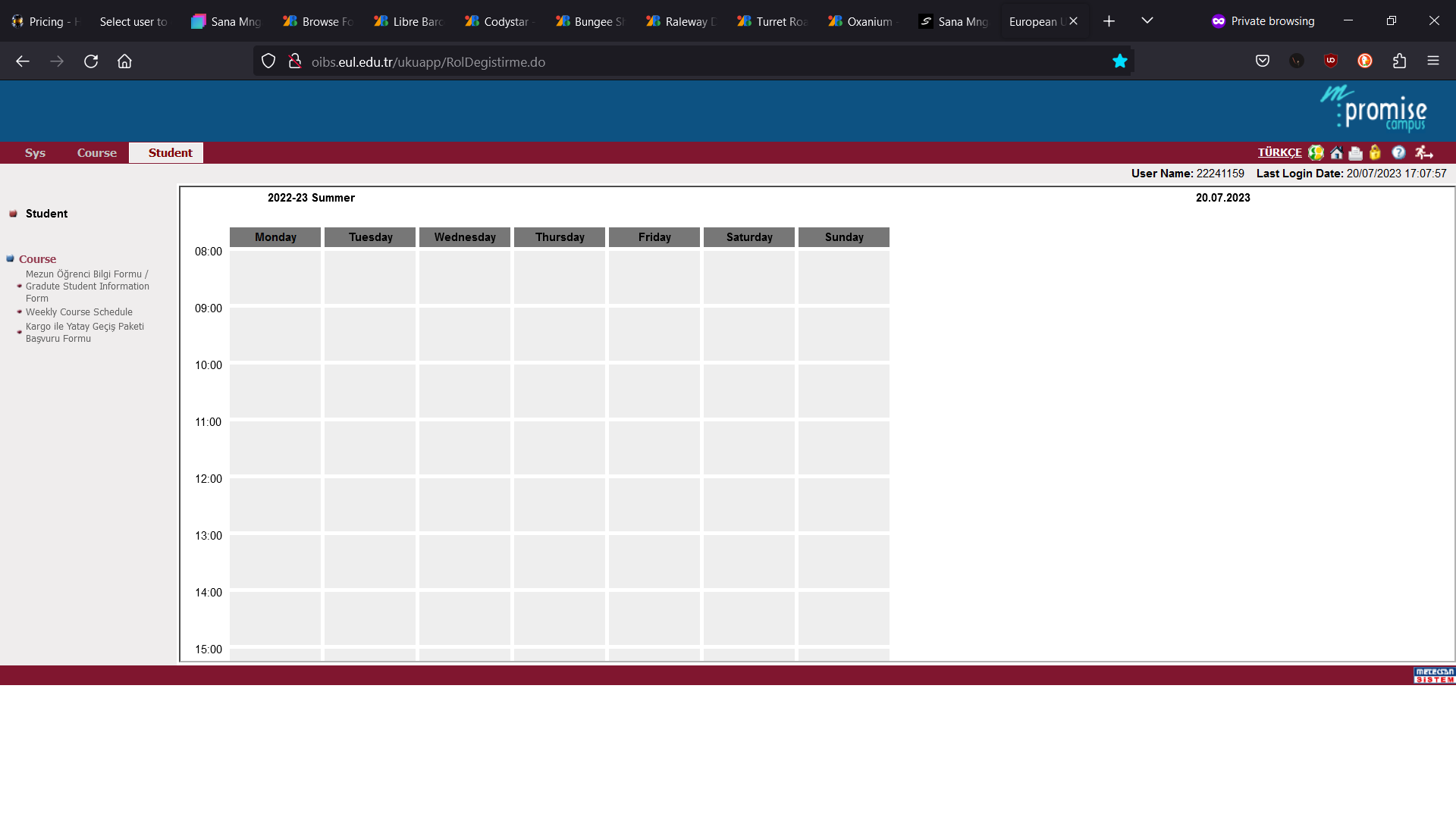
Slide 9 - On this page we can find the most looked for information.
To find this page requires 5 clicks (this is counted after logging in). As we can see it is a grid setup, with days of the week as the columns and times from 8:00 till 19:00 as the rows.
Since this page is not responsive on smaller screens it requires users to zoom in and try to see the time and day, then move to what ever block contains the information they are looking for.
Each scheduled course would have their classroom number under it and you cannot find what building it is in online, you need to walk around campus to find the classroom.
Moodle
Moodle problems:
- Too many clicks to perform simple tasks.
- No auto enrolment to courses.
- No task tracking (If you did an assignment or watched a video it would not track your progress).
- Opens new tabs for lecture videos.
- Confusing UI/UX design.
- Short session periods.
- You can only be logged in on one session at a time (If I login on my laptop, it would log me out of my phone).
- Requiring downloading files to see announcements.
- Forgot Password page exposing sensitive information (Security Issue).
- No building information.
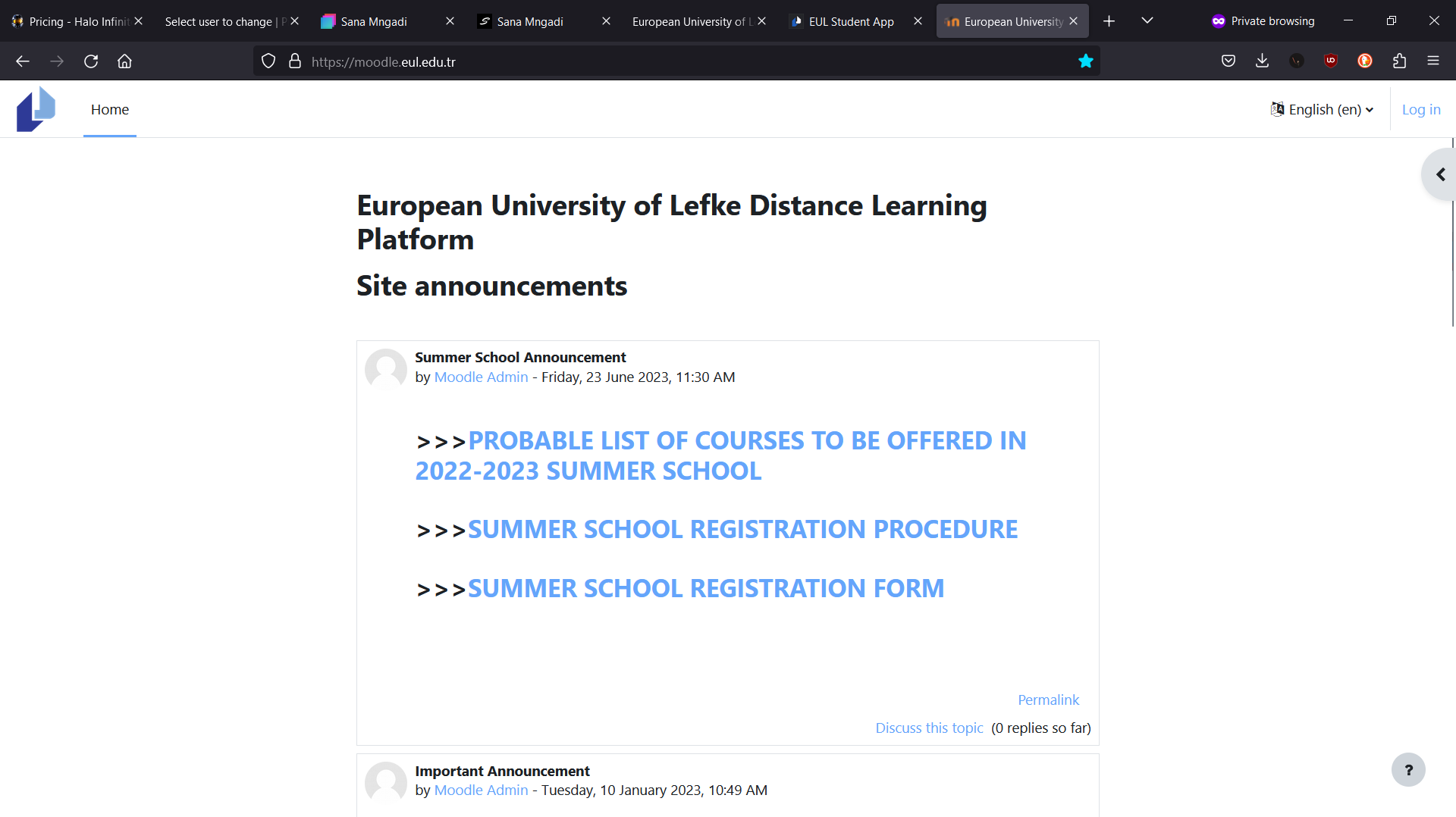
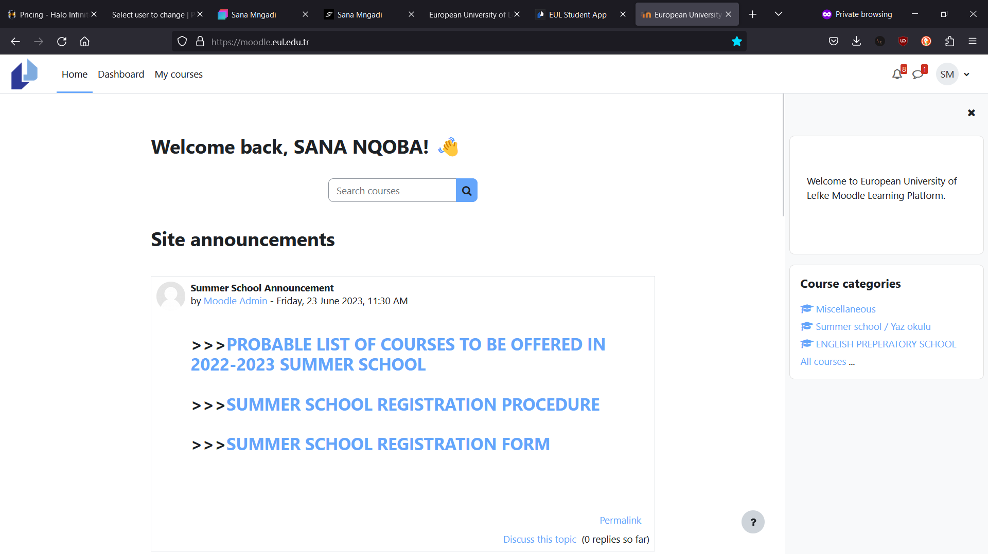
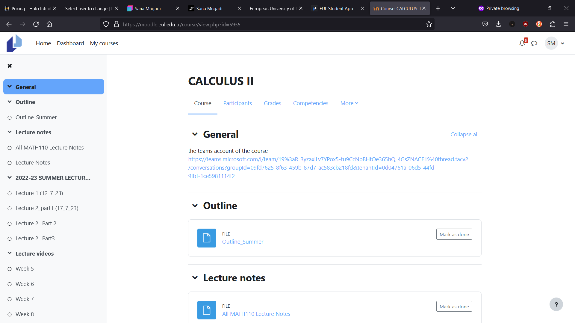
Slide 1 - This page is the landing page for the Moodle, it typically shows the announcements for the users, but requires the users to download files to open using a PDF reader or word press. This is a security issue and also a inconvenience to the users as they would need to download third party software to read the announcements.
*Some browsers read PDF files, but on mobile you need a third party app to open PDFs.
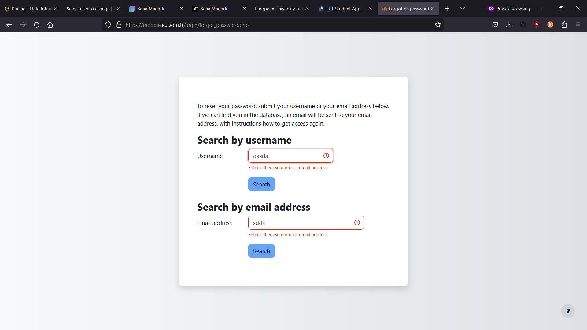
Slide 2 - This page is the Forgot Password, if an attacker is looking information on who has an account on Moodle, they can use the Forgot Password form to validate if a username or email address is being used and send that user a phishing email or message.
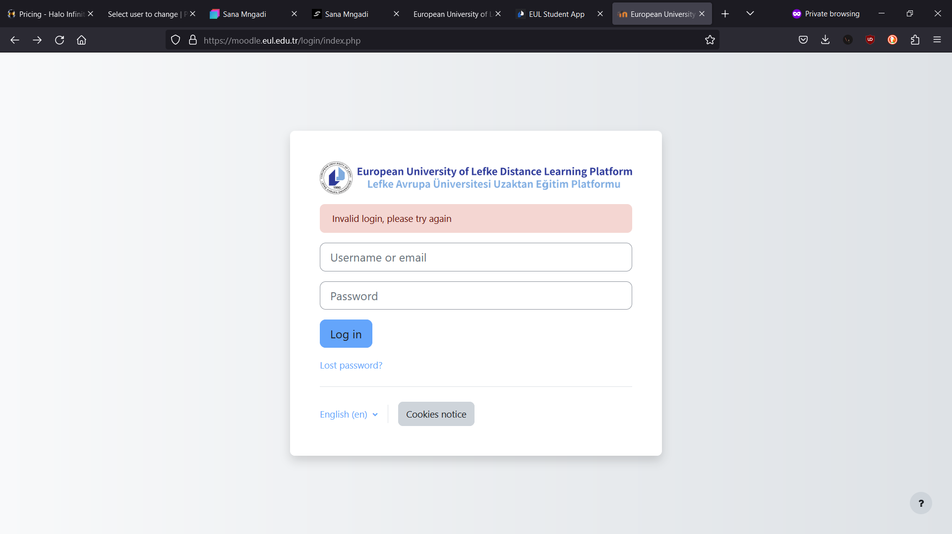
Slide 3 - This is the user Login page, all normal users will use this page for login in. There aren't any issues I've identified here except the "Invalid Login. Try Again" message as I would prefer it to say "username or password is wrong!".
Slide 4 - This is the page you are directed to after Sign In in without a next page request. It sends you back to the announcements and this time has a "search course" bar and when searching for courses it shows all the courses on the platform, not the ones that the user is doing (enrolled). From most users I've surveyed, most get lost and confused on what it going on here.
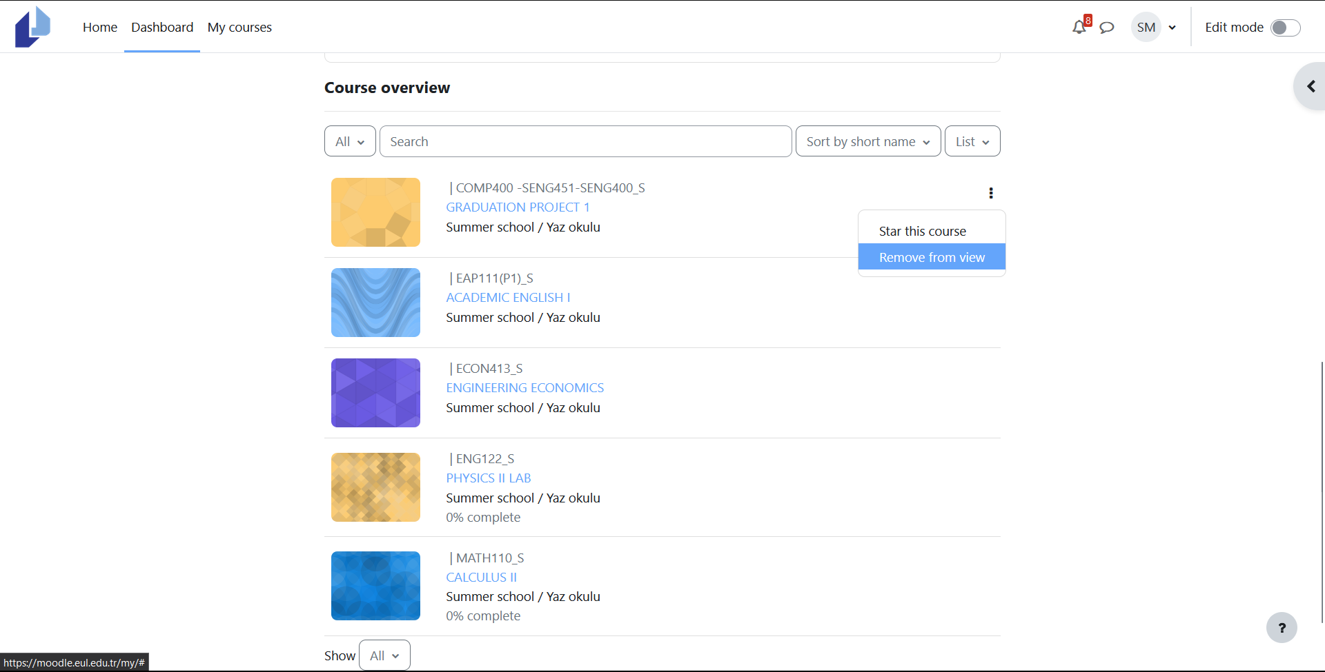
Slide 5 - This is the Dashboard page, here the users should see all their courses that they are enrolled in, but if the user clicks the "remove from view" on a course the course disappears and there is no visible way to add it back, but they are still enrolled in the course.
The list of courses are randomized on each reload of the page, sometimes it can be last viewed first and sometimes it can just be random, this leaves users frustrated and unwilling to continue using the dashboard.
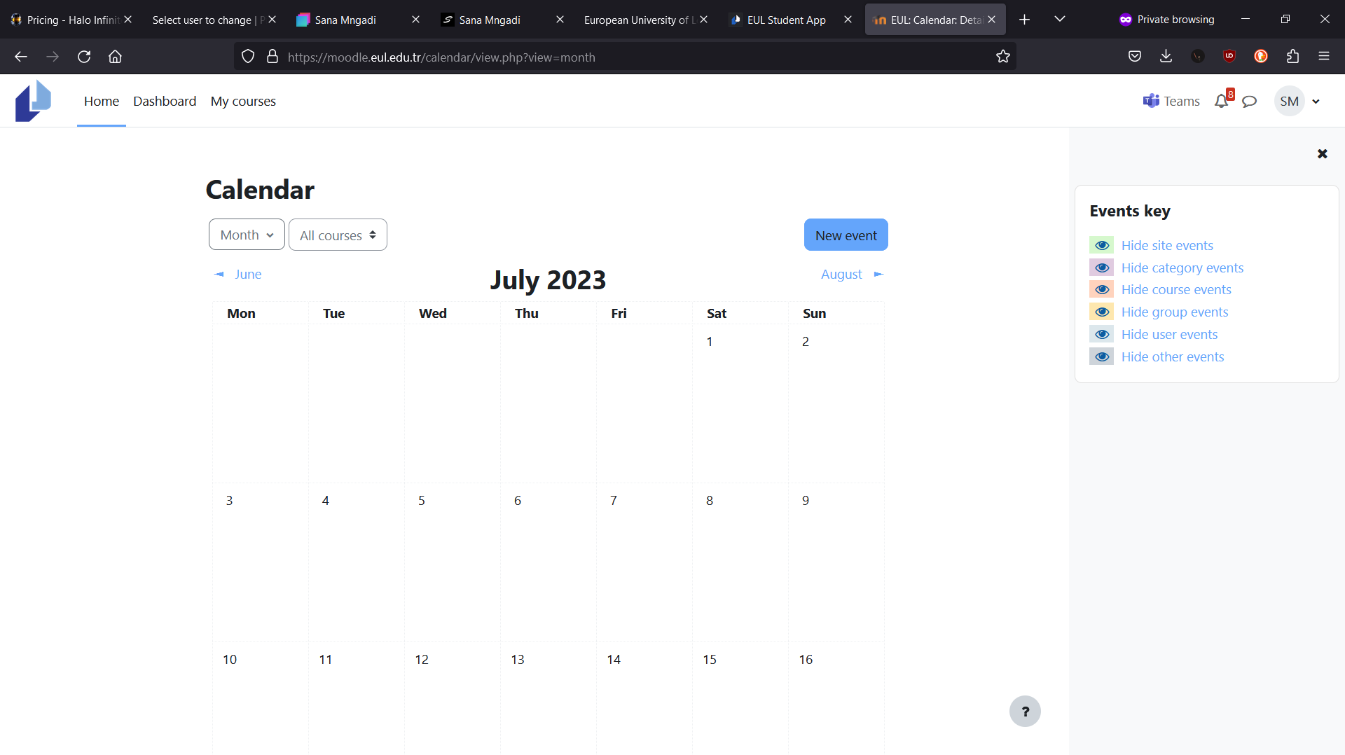
Slide 6 - This is the Calendar page, here users are supposed to be able to see upcoming events (quizzes, exams, assignments, etc) and they can manually add events for themselves only. Most of the time lecturers never had events to the calendar for their courses and a lot of students end up not knowing that an event is scheduled.
This is supposed to be a useful feature, but no user is taking advantage of it.
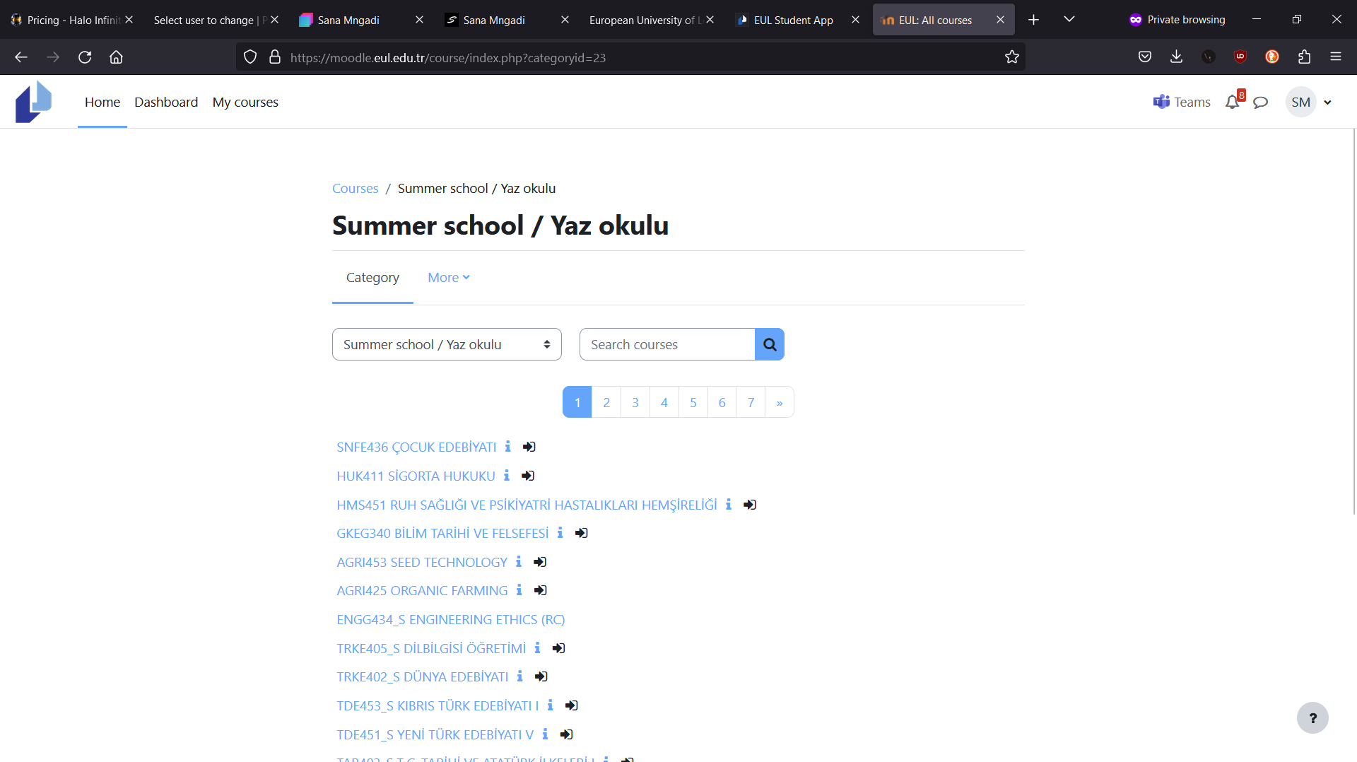
Slide 7 - This is the page users would use to find the course they are enrolled in. So during the time I was exploring and analysing this page I found out that there is 3 different "Search" pages, they all do the exact same task, but a difference in the search query.
2 pages do not do wild card searching, if a user searches "NG" it will only search for "NG" and not anything matching "NG".
Only 1 of the search pages uses wild card search querying.
Slide 8 - This is the course page where users can find all their course material including (quizzes, assignments and exams).
The pages layout is more like a list starting from General information down to Homeworks(Quiz).
There is no progress tracking for any of the items on the page, specially if users are watching lecture videos online there is no progress to know what videos you've watched or where in the video did you stop, plus a bonus issue is that videos require opening a new tab or redirecting to the video.
When performing assignments, quizzes or exams there is no system to avoid users that have completed them, causing users to be confused and double check if they've done them.
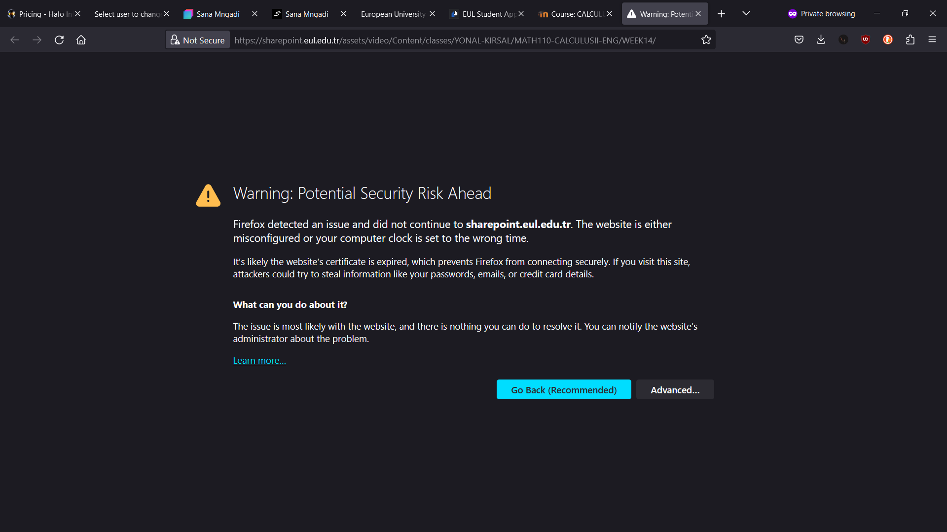
Slide 9 - There seems to be a misconfiguration with the server serving the lecture videos. This is probably a know issue, but has not been fixed.
plan
Story Time
My first step is to figure out how will I get the data from OIBS and Moodle.
The first objective is to build scripts to get data from OIBS, but we need to be able to authenticate users and access their data.
After a couple of days exploring different methods, I finally figured out one that works and gives me the ability to use it as a way to verify OIBS users. *For security purposes I will not disclose how the authentication works.
Now that I have the ability to authenticate OIBS users, I could start collecting their data.
Using python "Beautifulsoup" library I am able to scrap the pages with the required data. Most pages are easy as they have unique IDs or class names I could use to identify the data I want, but the schedule page has a different story as there is no IDs or class names for each block on the grid. So I have to figure out how to calculate each position and determine what time and day the block is.
After a while I managed to get all the data I needed from OIBS, I can now rebuild the scripts to improve performance and reliability.
Now that I am able to collect the curriculum for users from OIBS I can use the "*" for identifying the current courses the user has to do in the relevant semester and this comes in handy when I need to perform actions on Moodle.
After building all the scripts I need for OIBS I can now focus on Moodle. First step is authenticating the users, so the first step is trying the same method that worked for OIBS on Moodle and it works.
Now that I have access to users Moodle accounts I can start coding the scripts for Moodle, everything was similar to OIBS except when handling date and time formats. So when collecting calendar events the date & time format is "12/03/2023 6:00PM" except for when the event is happening the next day "Tomorrow, 6:00PM" so I wrote a if statement to check for the "Tomorrow" in the string and also for if the PM is AM or the user has chosen to use 24Hours.
Now I have all the data I need from Moodle, next step I built a script that is able to get the registered courses from OIBS and search for them on Moodle using the course code (each course has a unique code) when a course was found successfully it would enrol the user into their course automatically and if there is a conflict (Two or non show) it would tell the user that we weren't able to enrol them into that course and they need to manually check for that course.
Now we are done with Moodle and OIBS scripting I can move on to building the UI/UX and other features.
Time awareness:
Now schedules and events have times, I have to make the time change to the users time zone if they are not in Cyprus, so I researched Django time awareness functions and I was able to use it, I just needed the users time zone and unfortunately I can't just get it from Django.
So the plan is I set up a call to an IP API service in the Front-End that would return information about the users IP address and send their time zone information to the Back-End where I could set it as a cookie.
Language:
Since this is an international university there are many students from different countries (Turkey, Morocco, Ukraine, Mozambique, Sudan, Kazakhstan, Philippines, Nigeria, Tunisia and more) meaning that I have to make the application multilingual, so I researched and learnt how to add multiple languages without having to make different templates for each language.
Django has functions that help with multilingual websites, so I took advantage of them adding support for a limited amount of languages English, Portuguese, Turkish, Ukrainian and Kazak. I stopped at these languages because each language file would take me 3-4 hours to do and when I attempted to use a API for translations the API would add words that did not exists or symbols instead of words.
Now I only know English and Portuguese so I don't think I should add more languages because I do not know what each word means.
Notifications:
Prior to this project I had never added push notifications, so this is my first project adding push notification. I had already used email notifications as they are way simpler to add then push notifications.
So first we make a list of what we want to notify the user of, schedule changes, new moodle events, exam posting, new lecture videos/notes, announcements, account balance changes, connection failures for OIBS and Moodle and reminders of what classes they have in that current day.
So I use SendGrid to build the email templates for each notification and added them afterwards I built a ServiceWorker for the push notifications from Firebase and this was a little tricky being the first time using ServiceWorkers. After completing the ServiceWorker I tested it for a while and noticed that it didn't work all the time, so I reseached more and more.. and more.... I learnt that push notifications for Android and iOS don't work the same as a native app and in order to receive push notifications the browser needs to be open (Can be open in the background) but the moment the browser is closed the push notification won't show.
Authentication:
From my experience of using other services, I know that remembering passwords sucks and saving the password to your browser gives a chance for hackers to steal it. So I researched how to add third party authentications that allow users to Sign In or Sign Up using Google, LinkedIn, Apple or Microsoft so my users never need to remember any passwords and the great thing about using Microsoft is that I could access my users course Teams chats on Microsoft Teams and monitor for any new messages from lectures or moderators. Unfortunately Apple requires a paid developer membership plan for their Sign In with Apple and I do NOT have money to pay for it xD
Announcements:
My plan here is to make announcements more appealing to my users. When a user signs in to their account if there is a new announcement it will popup on their screen similar to Discords popup for when new updates are released, like this it's not too pushy and allows the user to not feel attacked by a popup, when they click the announcement it will send them to a page dedicated to that announcement. Announcements are controlled by moderators that are allected by staff admins.
Guides:
The guides work the same way the announcements do except they don't show up as popups, the user can navigate to the guides page to find new guides.
Bus Schedule:
The bus schedule for the university is hard to find, so adding a built in bus schedule helps all my users as they wouldn't need to search around for it.
The schedules can be added, edited or removed by an admin straight from the UI.
Campus Map:
A lot of students don't know where their classes are, so adding a map of campus with a search bar for each room and building would help students find their way around campus. I wanted to build a 3D map of campus, but unfortunately I don't have a environment scanning tool or the time to build a 3D map by hand, so I will use Google Maps.
Fast Page Rendering:
To speed up the time it takes to render a page, I would render the template as is without any data and as the page is show on the users device I would use AJAX to make a request to the Back-End for the required data.
Offline Cache Use:
Most of the foreign students don't pay for internet and North Cyprus requires each student to register their phone with a fee that is dependant on your phone model, so making the website work offline was an important feature I have to implement.
You can find down bellow more information.
What I leant
- How to use OAuth for Google, LinkedIn and Microsoft.
- How to go through the verification process for Google.
- How to build RestAPI endpoints.
- How to make a better user experience.
- How to make better documentation for working as a team.
- How to optimize python performance for data mining.
- How to use SSL certificates with requests.
- How to build a video control UI and track video progress.
- How to build authentication systems.
- Improved my JavaScript skillset.
- Improved my Python skillset.
- Improved my email template skillset using SendGrid.
- How to use Web Push Notifications.
- How to use PWA caching for offline use.
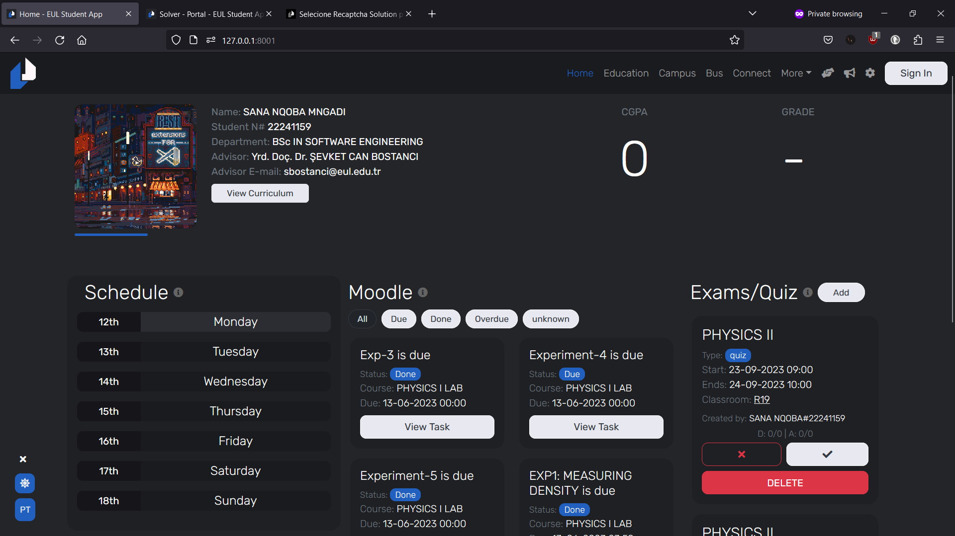
EUL Student App
A student companion app for European University of Lefke
Feeling Good
Year: 2023 Type: Web Application Front-End: BootStrap 5, JavaScript, CSS3, JQuery, HTML5 Back-End: Django, Python Team Size: 1
Developers: Sana Mngadi
Last Know Domain: https://feelinggood.company/
Objective
This project is a website for a company called Feeling Good where they can talk about their company and the mission of their company as well as show their products, post blogs and recipes that can be made using their products.
Story
In this project the goal is to make a website that represents the company and it's mission for organic products and renewables.
I was given example websites and the brands font family and colour palettes.
The website needed to be in English and Portuguese with every paragraph editable by an admin, this for me would be a challenge as every page required that it has as much editability as possible.
This story is short...
Problems
Editable Pages
The most challenging part for me in this project was making that every page can be edited and also the websites favicon and description by an admin.
For every page I built edit buttons that would show if a user has the right permissions, using JS (JavaScript) I could allow the user to edit and save without reloading the page.
But only reload the page if the save was successful, also there would be too much JS (JavaScript) code for each page.
plan
Client Satisfaction
Before we start coding anything, I first presented the UI to the client and got her feedback. If I change an image I need to know the client is satisfied with the replaced image, also I would explain to the client the user flow for each page with animations.
Once the client is satisfied with all the UI designs, I can move on to coding everything.
Admin Panels
Each page requires admin panels for editing it's content. To accomplish this I would add edit buttons next to each paragraph and when clicked it would change the "paragraph" HTML element to a "TextArea" HTML element where the user can change the paragraph and a save button at the bottom.
With images I would have a "Edit" button in the image at the Top-Right corner that users could select and it would prompt the user to choose a new image.
All this JS (JavaScript) code is repetitive across all pages and in the same page, so I made it that editable has a Form Action and when saving to send the data to that Form Action, like this we can have one function for editing paragraphs and images.
Now for content admin panels that are not the same, I made them Modal popups like this one you are reading from just with the required input fields depending on the content required.
For the websites contents like Favicons, Description and contact information I built a admin dashboard page where Staff can make the necessary changes with also access to Django Admin panel
What I leant
- How to build admin panels.
- How to use A2Hosting better with CPanel.
- How to optimize my JavaScript.
- Improved my UI/UX designing skills
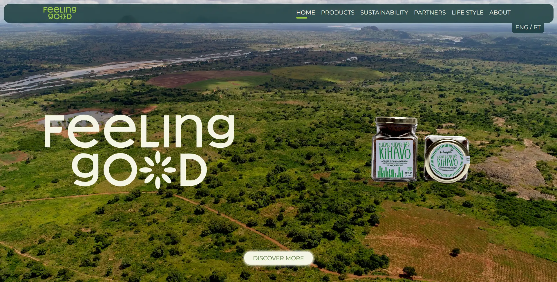
Feeling Good
A company website
Pixrweb
Year: 2020 Type: Web Application Front-End: BootStrap 5, JavaScript, CSS3, JQuery, HTML5 Back-End: Django, Python Team Size: 2
Developers: Sana Mngadi
UI/UX Designer: Taha Chimar
Last Know Domain: https://pixrweb.com/
Objective
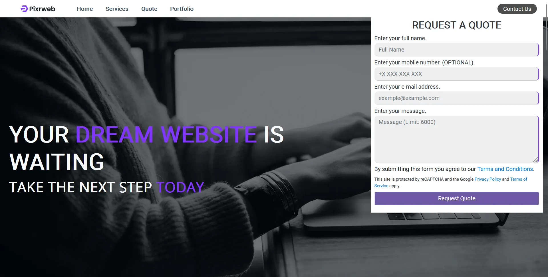
This project is a website for a company I am a Co-Founder of called Pixrweb, it is to allow potential clients to be able to contact us and find information about us.
Story
The company was founded in 2020, two years after I started learning how to code. I met my business partner Zext (Padraig) and we would partner up to take on mostly eSports Orgs and Twitch Streamers looking to build their own websites, sometimes e-commerce or stats applications.
Problems
Form Submission Notifications
The challenge of this project was how would we easily get notified when a user submits the Quota Form.
plan
Quota Form Notification
Since we have a Discord Server for our team, one of our earlier developers suggested using webhooks with our Django backend.
So the plan was so understand what can be done using the Discord webhooks and if it was safe, after doing some research on how to implement the webhooks we setup a special channel on Discord to receive the production webhook messages and one for the testing webhooks.
Now that we have done that part we would also send emails to our company inbox with details of the Quota Form.
What I leant
- How to use Discord webhooks.
- How to send emails using Django Email functions.
- How to build email templates using SendGrid.
- How to use BootStraps animations.
- How to work as one with UI/UX team.
Pixrweb
A company website | Co-Founder
Venato
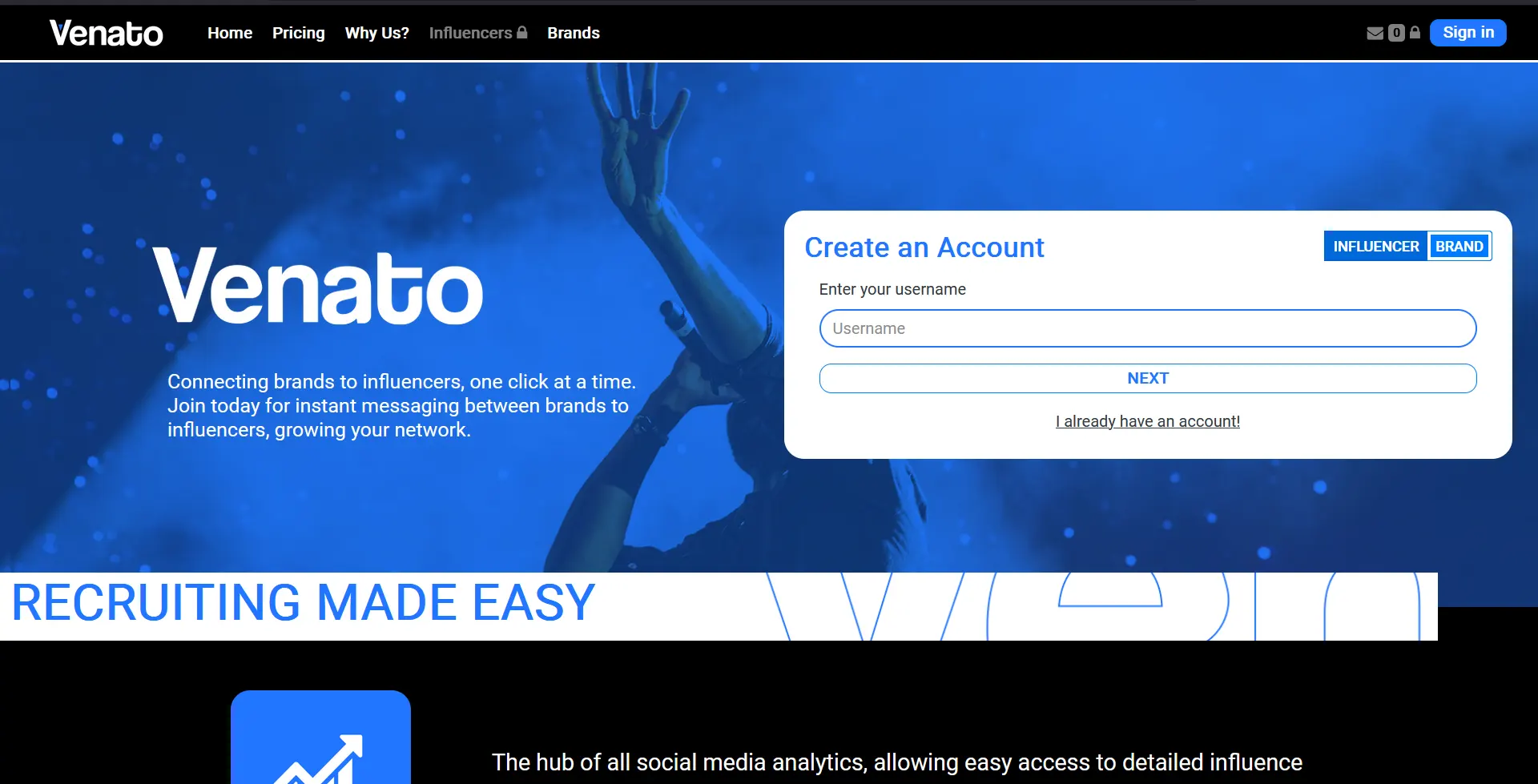
Year: 2021 Type: Web Application Front-End: BootStrap 5, JavaScript, CSS3, JQuery, HTML5 Back-End: Django, Python Team Size: 2
Developers: Sana Mngadi
UI/UX Designer: Taha Chimar
Last Know Domain: https://venato.pro/
Objective
NDA
Story
NDA
Problems
NDA
NDA
plan
NDA
NDA
What I leant
- How to use Instagrams API.
- How to use Twitches API.
- How to use YouTubes API.
- How to use TikToks API.
- How to go through verification processes by Facebook (Meta).
- How to utilize BootStrap graphs API.
Venato
A stats website
